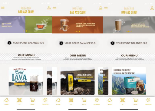
The new Home Screen presents only widgets: containers of data, images and buttons. Clicking on components of the widget will open other relevant screens.
📚 In this article...
Add Widgets
Profile Widget
Welcome Message
Point Shop Widget
Auto-Redeem Points Widget
Tiles Widget
Catalog Widget
Carousel Widget
Add Widgets
From Content > Layout > Home Screen (NEW), add up to 10 widgets in the order you want them to appear. Add only the number of widgets you want and leave the rest empty. You can add the same widget more than once.
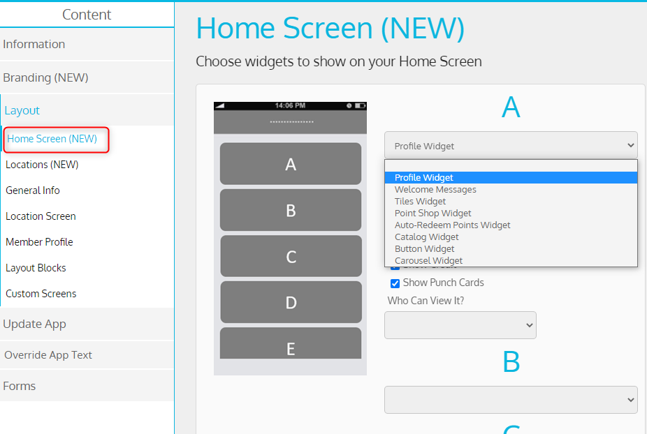
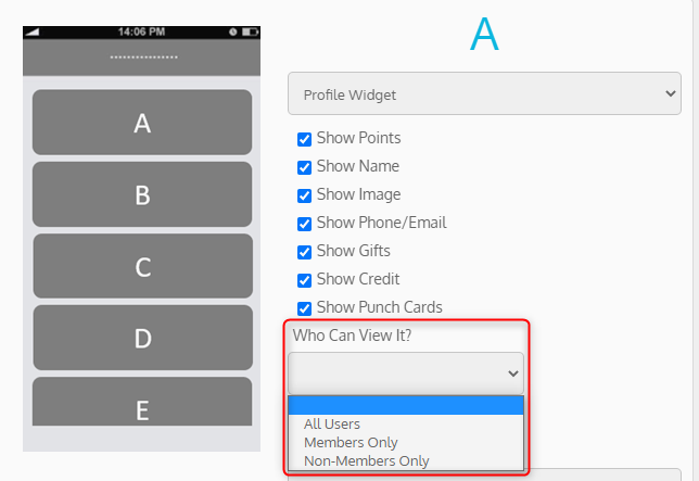
For each home screen widget, choose who can view it:
1. All users (default behavior)
2. Members Only
3. Non-Members only
This capability enables you to decide who will see what on the home screen.
Note: This setup is added to all home widgets.
Profile Widget
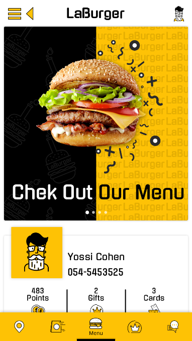
The Profile Widget displays member details, benefit count and a custom button (optional). If the user isn’t logged into the app, a Login Now button is displayed instead.
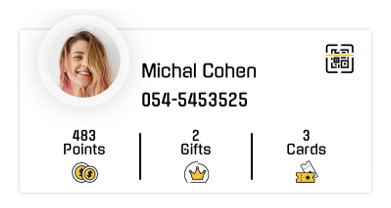

Tapping on a section of the widget opens relevant screens:
- Gifts opens Gift List
- Cards opens Punch Card List
- Points opens screen you specify
- Credit opens screen you specify
- Name/identifier/image opens Profile
- Custom button opens screen you specify
Step 1 – Add Widget
From Content > Layout > Home Screen (NEW), select Profile Widget and then select what to display:
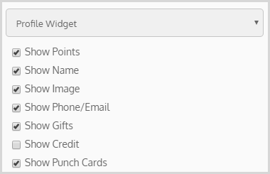
NOTE: If you select credit, points, punch cards and gifts, then 4 benefit buttons will appear instead of 3.
|
Component |
Description |
|
Image |
Member image (when member connects with Facebook), otherwise a (customizable) icon |
|
Name |
First and last name |
|
Phone/Email |
Phone or email (based on which field we have for this member) |
|
Points |
Points balance |
|
Credit |
Credit balance |
|
Gifts |
Number of active gifts |
|
Punch Cards |
Number of active punch cards (including cards that aren’t yet fully punched) |
Step 2 – Add Custom Button (Optional)
You can add a custom button to your profile widget to appear in the top-right corner. If you display points and/or credit, you also need to specify which screen to open when the user taps Points (or Credit) since different screens may be relevant for different businesses. For example, you can open the Point Shop, the Point Verification Code screen used for payment, or My Activity screen to show the member’s point transactions. Both these buttons can be specified using a special custom screen. Learn more
Welcome Messages
Step 1 – Create Welcome Messages
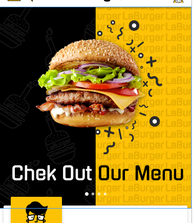
Create welcome message from Content > Information > Welcome Messages. All the settings still apply, but the button action will only work if it’s supported by the new app. See Graphic Guidelines
Step 2 – Add Widget
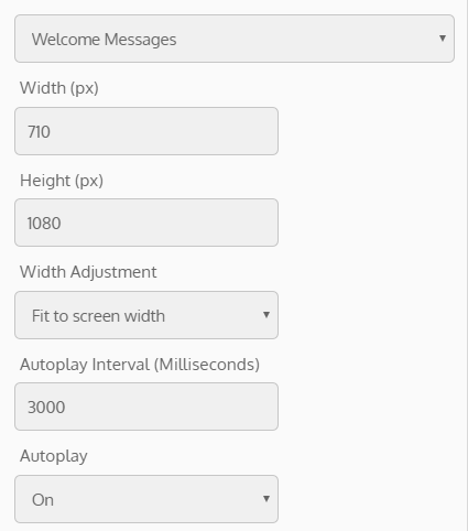
From Content > Layout > Home Screen (NEW), select Welcome Messages and specify these settings:
|
Field |
Description |
|
Width (px) |
Image width and height in pixels NOTE: The image will be adjusted proportionally for different screen sizes. Learn more |
|
Height (px) |
|
|
Width Adjustment |
Image width can be fitted to the standard widget width (A), or to the screen width (B) A: |
|
Autoplay Interval (Milliseconds) |
How long to show each message before automatically sliding to the next (if Autoplay on) |
|
Autoplay |
Whether or not to automatically slide to the next welcome message |
Point Shop Widget
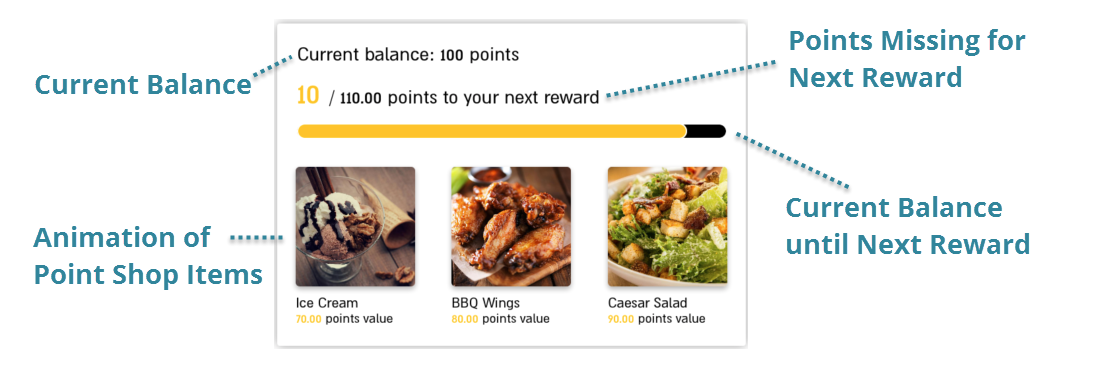
Encourage members to accumulate more points so they can buy the next reward: the next Point Shop item they will be able to afford (but is now above their current balance).
Step 1: Create Point Shop
Create your Point Shop from Benefits > Point Shop (after creating your gifts).
Step 2: Add Widget
From Content > Layout > Home Screen (NEW), select Point Shop Widget.
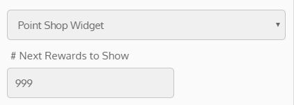
Then specify how many next rewards to show in the widget (i.e. Point Shop items that cost more than the member’s current balance).
💡For example:
Suppose the Point Shop has items with the following prices: 50, 100, 150, 200, 300 and the member has 100 points. If you select to show the 2 next rewards, then items with these prices will be shown: 50, 100, 150, and 200 (since the member can already afford the first 2 items, it presents an additional 2 “next reward” items).
NOTE: These items are displayed in an animation, starting from the most expensive.
Auto-Redeem Points Widget
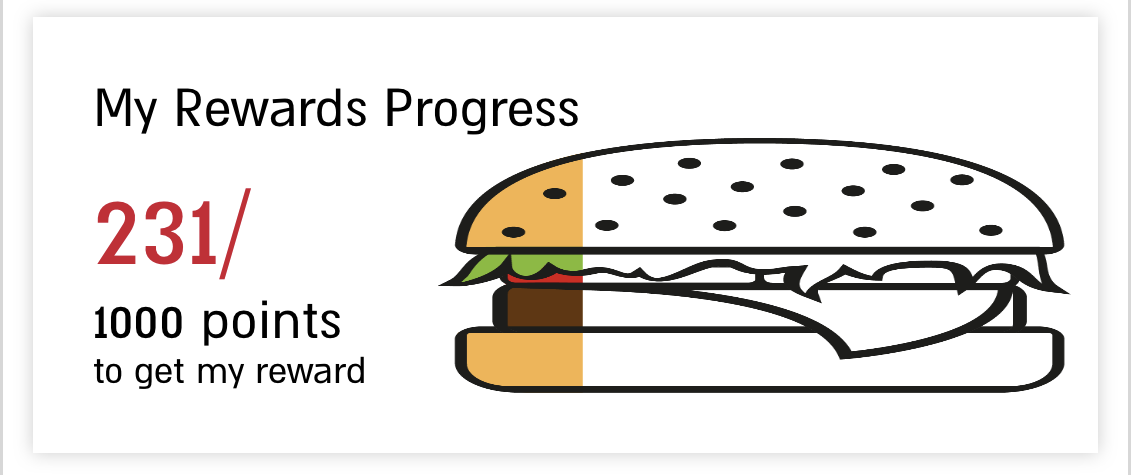
You can encourage members to accumulate more points by automatically redeeming their points for a reward once they reach a certain number (such as a free hamburger for 1000 points). You can now add a new widget to your Home Screen to show members their progress towards their reward.
Step 1: Create Redeem Rule
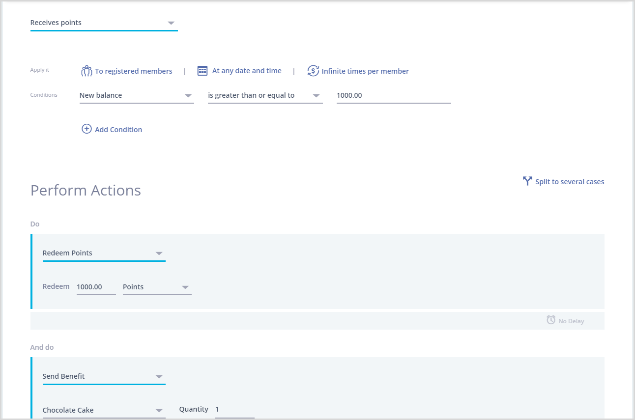
To automatically redeem points for a gift when members reach a certain balance, create a rule:
|
When Member |
Receives points |
|
Conditions |
New balance is greater than or equal to 1000 |
|
Action |
Redeem Points (1000 Points) |
|
Action |
Send Gift (the reward) |
|
Action |
Send Push (or another message to notify the member of their new gift) |
Step 2: Add Widget
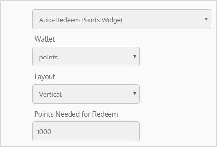
From Content > Layout > Home Screen (NEW), add Auto-Redeem Points Widget (see Widgets):
|
Field |
Description |
|
Wallet |
Which wallet is redeemed in the rule (points or credit) |
|
Layout |
Direction that the image is filled to indicate the progress: · Vertical – from bottom to top · Horizontal – from side to side |
|
Points Needed for Redeem |
Number of points needed to receive the gift (same as the rule) |
Step 3: Add Images
Progress is indicated in the widget using an image that fills up gradually. The image is empty when the member has no points and full when the member has enough points to redeem for their reward.
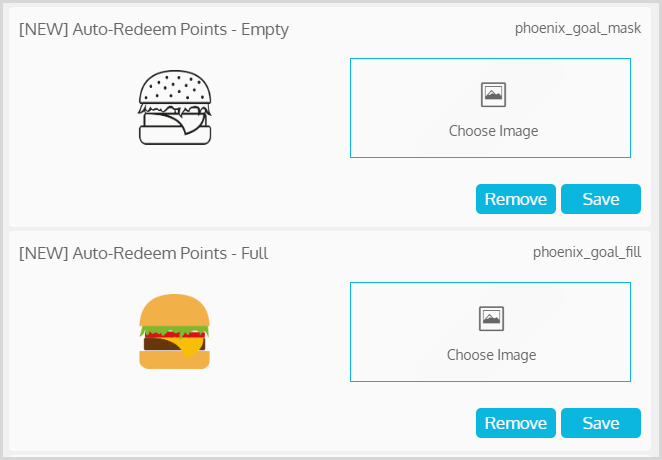
From Content > Branding (NEW) > Custom Icons (NEW), add images for the following icons:
|
[NEW] Auto-Redeem Points - Empty |
An image representing the empty state |
|
[NEW] Auto-Redeem Points - Full |
An image representing the full state |
NOTE: When choosing your images, keep in mind that they will be overlapped and the “full” one will be revealed gradually to indicate progress. So the empty image must represents an empty version of the full one.
NOTE: Instead of showing “to get my reward” on the widget, you can specify the reward from the app texts (for example, change it to “to get my hamburger”). Learn More
Tiles Widget
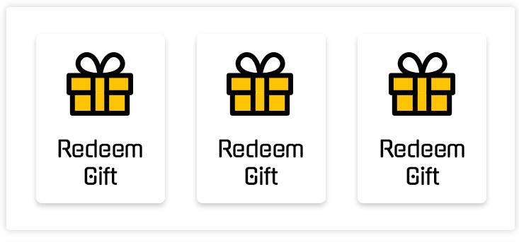
Each tiles widget can contain 1-3 tiles, and you can add up to 3 tiles widgets with different tiles.


Step 1 – Create Custom Screen
All buttons (including icons, titles and actions) are specified using a special custom screen. Since you can add up to 3 different tiles widgets for your app (where each widget can have 1-3 buttons), you can create up to 3 different custom screens for tiles widgets (each defining the buttons for a different widget). Learn more
Step 2 – Add Widget
From Content > Layout > Home Screen (NEW), select Tiles Widget. Then select the custom screen you created containing your tiles (ex: Tiles Widget Buttons 1), and the layout (text and icons, icons only or text only).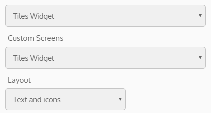
Catalog Widget
You can add a catalog widget to share your specials, news & updates, photo gallery, coupons, and more. You can fill them with items and add them to your home screen.
NOTE: It is recommended to use to for catalog with up to 7-8 items.
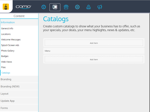
Step 1 – Create a catalog
From Content > Information > Catalog
NOTE:
- Only items are displayed
- Each item has one button
- If items have tags (displaying specific content for matching users)- make sure to have at least one item with no tags to make widget displayable
- Optionally- item can have an action when pressing the image (Custom action when category / Item is tapped)
Step 2 – Add Catalog Widget
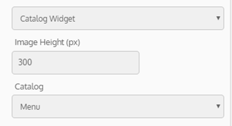
From Content > Layout > Home Screen (NEW)
- Image height (px)
- Catalog name (the catalog you created in step 1)
Carousel Widget
Add a Carousel Widget to share your specials, news & updates, photo gallery, coupons, and more.
From Content tab→ Layout → Home Screen (NEW)→ Carousel Widget.
Create a layout block → Create a tile widget or choose an existing one → from the home screen page select Carousel Widget and add the relevant tile widget.
- You can have up to 5 items in a carousel
- The width must be 1080px
- Ideal height is 860px
- The height can be custom if required

 B:
B: 