📚 In this article...
Colors
Logo & Background
Design
Custom Icons
Colors
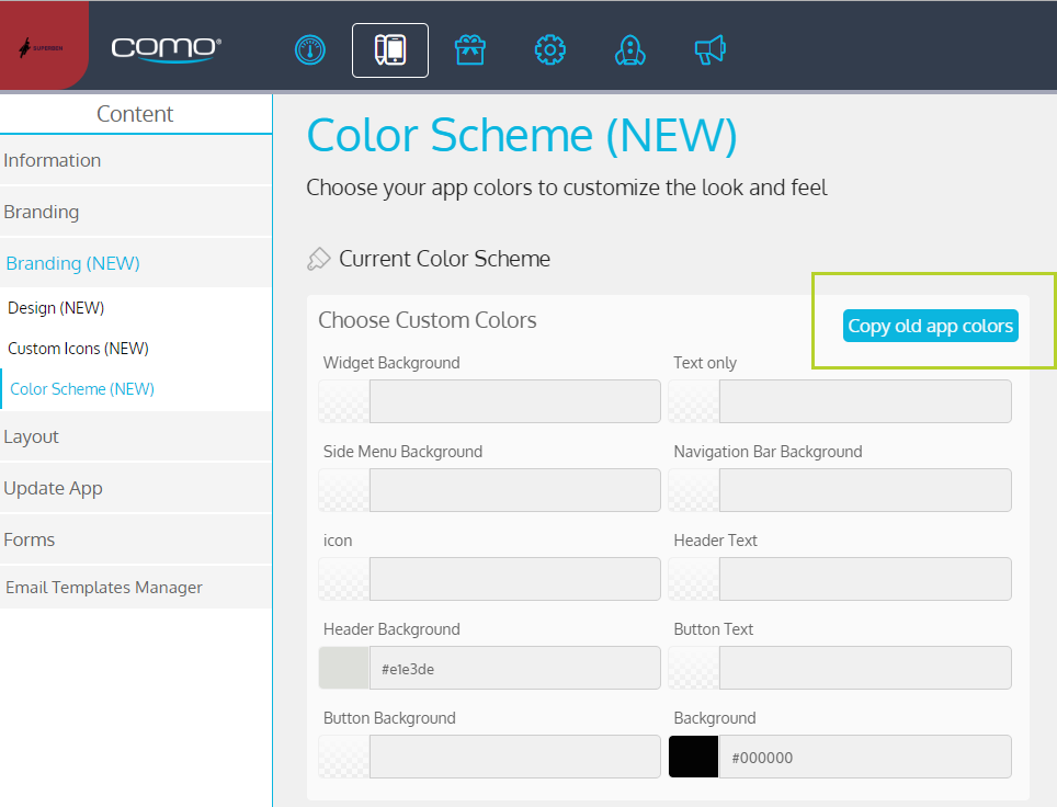
All the colors for the new app are configured from Content > Branding (NEW) > Color Scheme.

If a business already has an app, the old color scheme can be migrated automatically to the new gen app by clicking Copy Old App Colors. The colors are migrated as follows:
|
Old Color Scheme |
New Gen App Color Scheme |
|
Background Overlay |
Background |
|
- |
Navigation Bar Background |
|
Text |
Icon |
|
Text |
Text Only |
|
Page Header Text |
Header Text |
|
Page Header Background |
Header Background |
|
Button Text |
Button Text |
|
Strokes and Buttons |
Button Background |
|
Side Menu |
Side Menu Background |
|
- |
Widget Background |
|
- |
Navigation Text |
Some Important Tips
- You can even customize the color of your icons using the Icon
- The registration form colors are taken from here if the colors are configured, even if the registration form appears in the old app version. Keep this in mind before you publish any color changes for your new gen app (even if this app isn’t yet available)
- The following colors must be different:
- Text ≠ Background, Side Menu, Navigation Bar or Widget
- Background ≠ Text or Button Background
- Button Background ≠ Button Text or Background
See Graphic Guidelines for tips on how to choose the right colors for your app.
Logo & Background
From Content > Branding > Logo & Background, add the logo for the app icon only.
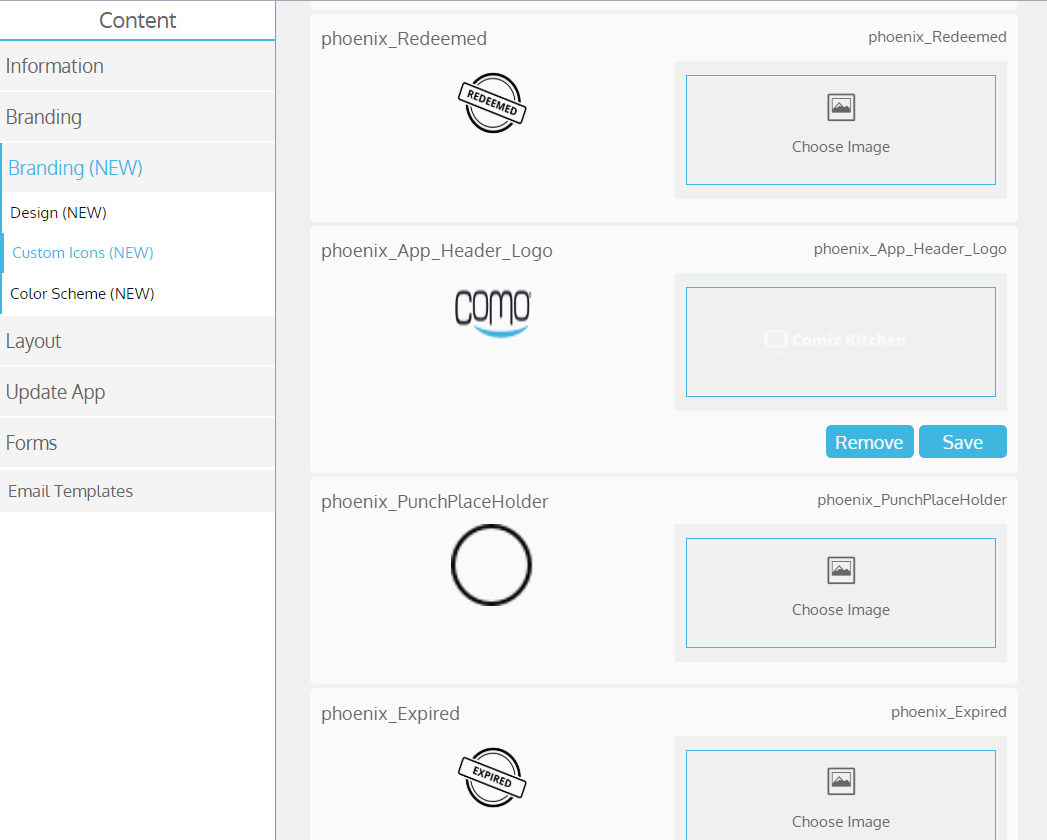
From Content > Branding (NEW) > Custom Icons (NEW), add the logo for the app header:

From Content > Branding (NEW) > Design (NEW), you can add a background image URL (including an animation). The image will be stretched to full screen. If no image is added, the background color will appear instead. If you add an animation (.gif), make sure to run it on loop (configured in the file itself).
NOTE: Web views (except registration form) display the old app background image if there is one (if not, then the new gen app background color; and if there isn’t one, then the old app background color).
Design
Content > Branding (NEW) > Design (NEW), you can configure settings that are only relevant for the new app.
| Field name |
Description |
|
Font Type |
Choose a font for your app NOTE: If you want to use a custom font, it must be selected before submission |
|
Tile Corners - Rounded or Square |
Choose a rounded or Square tile corner |
|
Navigation Bar - Upper Shadow line |
Add a thin shadow stripe to the navigation bar |
|
Navigation Bar - Layout |
Choose to present Text and icons/icons only in the navigation bar |
|
Navigation Bar - Button Colors |
The button colors of the navigation bar |
|
Profile widget - Member Details Text Alignment |
Member Details Text Alignment to Auto/Left /Right /Center |
|
Login Button extra Top Gap (Pixels) |
Add extra gap to login button on the main page of the app |
|
Login Button Style Override- Width (Pixels) |
The width of the login button on the main page of the app |
|
Login Button Text Size (Pixels) |
The text size of the login button on the main page of the app |
|
Login Button Style Override- Text Color (Color name, rgba or hexa format) |
The text color of the login button on the main page of the app |
|
Login Button Style Override- Height (Pixels) |
The high of the login button on the main page of the app |
|
Login Button Description Text Color (Color name, rgba or hexa format) |
The text color of the description that can appear on top of the login button |
|
Login Button Style Override- Bacground Color (Color name, rgba or hexa format) |
The background color of the login button on the main page of the app |
|
Login Page Background Image (URL) |
Add a background image to the login page |
|
Login Screen - Main Option |
Choose to present Login/registration as the main option |
|
Point Shop Version |
V1/V2- in order to display the point shop in the POS, choose V2 NOTE: the default is V1 |
|
Image URL for Successful Purchase |
Add a background for a successful purchase |
|
Update Profile Form - Background Image (URL) |
Add a background image to the update form |
|
Registration Form - Background Image (URL) |
Add a background image to the registration form |
|
Profile Screen - Background Image (URL) |
Add a background image to the profile screen |
|
Background Image (URL) |
Add a background image to the App |
|
Widget Shadow |
Add a thin shadow stripe to the widget |
|
Side Menu Icons |
On/Off - show/hide side menu buttons icons |
|
Side Menu direction |
Choose the side menu direction Left/Right/None |
|
Status Bar Theme |
Choose a light or dark bar theme |
|
Refresh Button |
With/Without a refresh button in your web views |
|
App Direction |
Set the app to be LTR/ RTL |
|
General Info Page Map Layout |
Show/Hide the general info page map |
|
Header Icons- Use Header Text Color |
Option to disable the coloring of header icons NOTE: the default is on |
|
Header - Lower Shadow line |
Add a thin shadow stripe to the header bar |
|
Header Image Height (Pixels) |
Enlarge the logo of the header |
|
Header - Image Always On (no text header for menus) |
Hide the logo from internal screens in the app |
|
Registration Form Opacity |
Ability to set the registration form with opacity NOTE: by default the opacity is off |
Custom Icons
The icon set is still selected from Content > Branding > Design. However, you can replace icons for the new app from Content > Branding (NEW) > Custom Icons.
The icon names indicate where they are used in the app and what the icon represents. If the icon name contains (custom), this means the icon is not used by default anywhere in the app. So if you choose another image for this icon, it will only be used for the button you choose this icon for.
The following icons are only available for the new gen app:
- Stamp for redeemed punch cards
- Stamp for expired punch cards
- Placeholder for punches in a punch card
- Logo for the app header

When migrating existing businesses to the new gen app, note the following:
- The default icon set is the same for both the old app version and new gen app. You can replace the default icons for the old app from the Custom Icons and for the new gen app from Custom Icons (NEW)
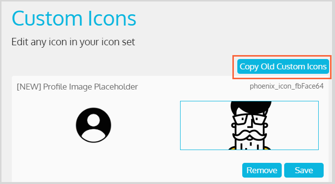
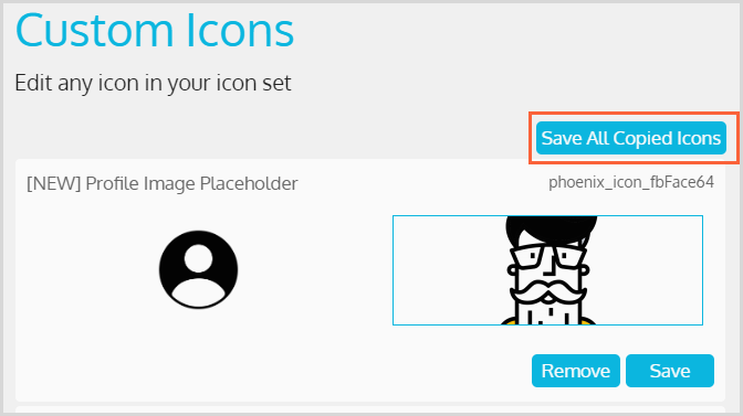
- If you replaced a default icon in the old app version, you need to also replace it for the new gen app (otherwise, the default will be shown there). From Content > Branding (NEW) > Custom Icons (NEW), click Copy Old Custom Icons to migrate all the custom icons added for the old app. Once all the icons are copied, you can either save specific icons individually or click Save All Copied Items to save them all


- If you use the same layout block for both the old and new apps or if they share button (such as from the Gift screen), then you can choose either the icons of the old app or the icons of the new app—however, the same icon will appear in both